Services
An identity that holds up unattended
Our approach
The mark is the start of it, not the job
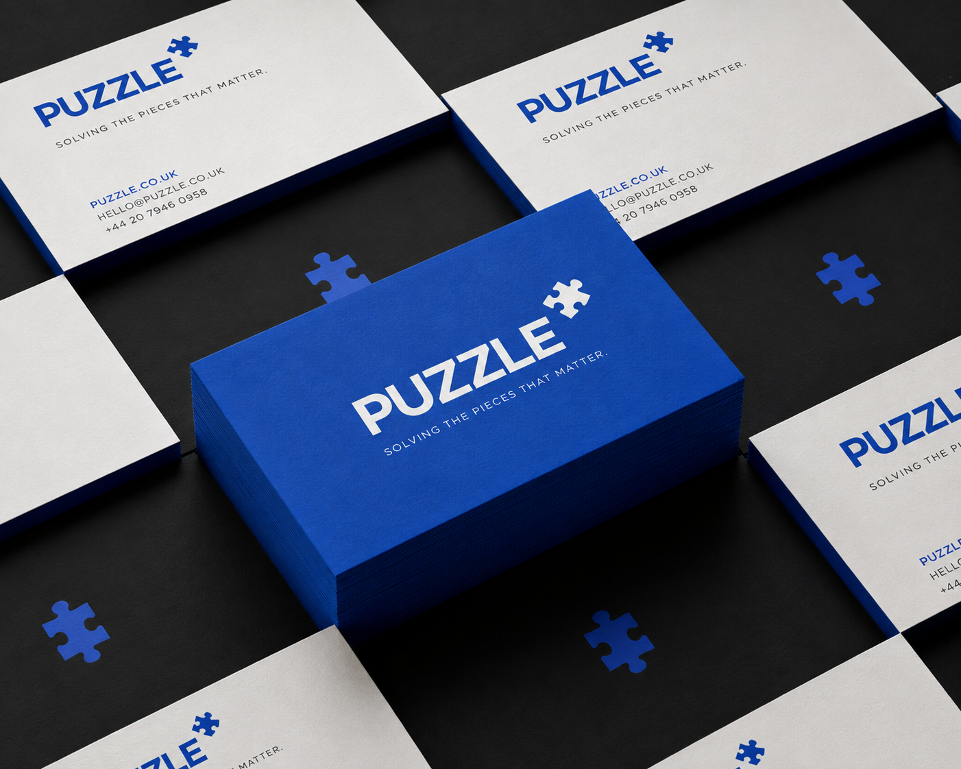
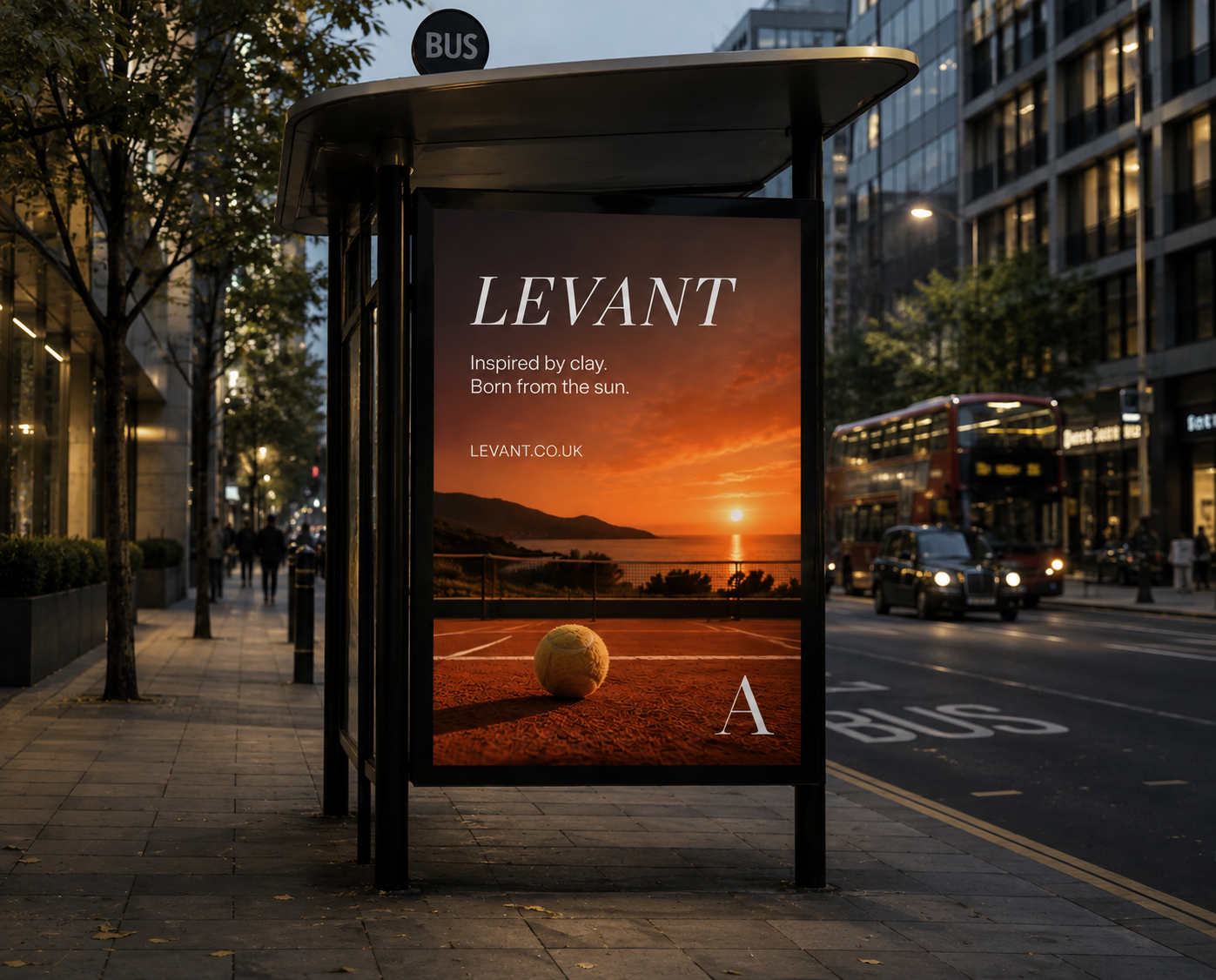
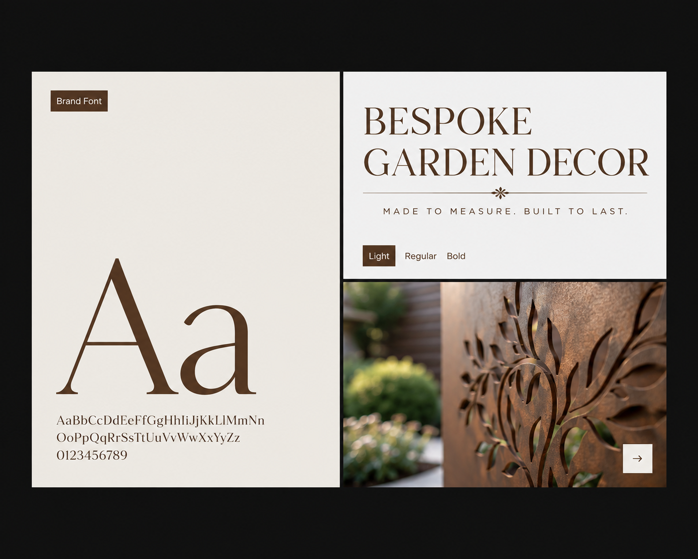
An identity is a system rather than a picture. The mark matters, but what decides whether it holds together is everything around it — the type, the spacing, the colour rules, and the templates somebody reaches for at eleven at night.
So the parts that get used most are the parts we design hardest, and what is allowed gets written down. Not a hundred pages nobody opens: the decisions that actually come up every week, answered clearly enough that a new person makes the right one without having to ask.
The test is never the launch. It is month seven, when the people who commissioned it have moved on and the brand is being applied by someone who was never in the room.
What you get
- Positioning and messaging framework
- Wordmark, monogram and lockups
- Type system and scale
- Colour system with contrast ratios documented
- Usage rules and a working template set
How it runs — 4 weeks
- 01Audit and positioning1w
- 02Territories1w
- 03Refinement1w
- 04System and rules1w
Timelines assume one round of consolidated feedback per phase. If you need this faster, say so early — it usually means changing the scope rather than the schedule.
Build a full scope