Services
Designed to look right, built to work properly
Our approach
A site has to look like you and still be fast, clear and worth the visit
We design against your real content, at real widths, in the browser early. A layout that only holds at 1440px with copy nobody has written yet is not a design — it is a picture of one.
Structure comes first: what the site is for, what someone needs to do on it, and the shape the content actually arrives in. Art direction goes on top of something that already works, so the visual design has something to be right about.
Then the same people build it. Design and development are not two jobs passed between rooms — they are one problem answered twice, and the handover document is where the answer usually goes missing.
Design
Structure first, then something to look at
Before a page is drawn we settle what the site is for: the two or three things people actually arrive to do, and everything else that is only there because a competitor has one. Most slow sites are slow because of what they contain, not how they were built.
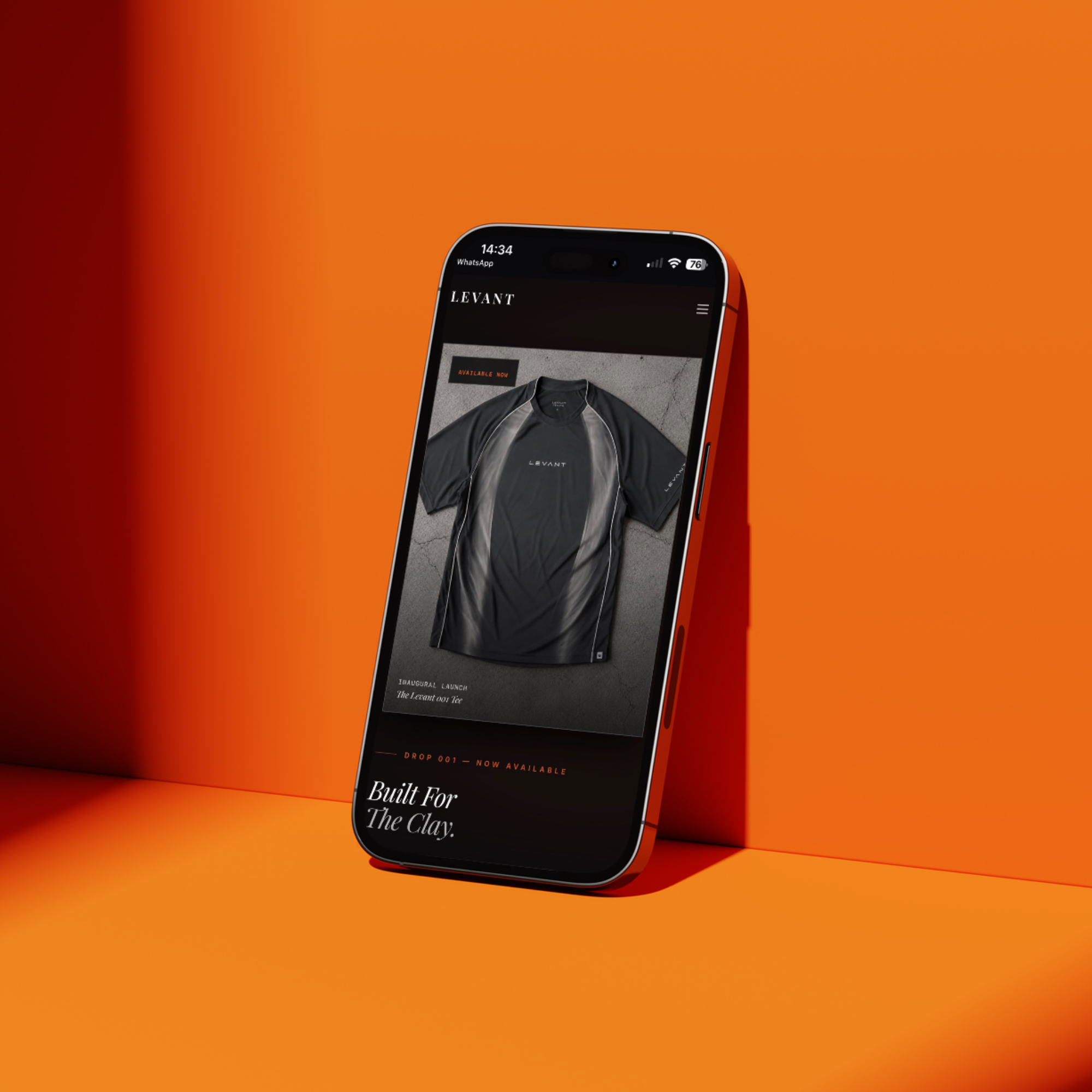
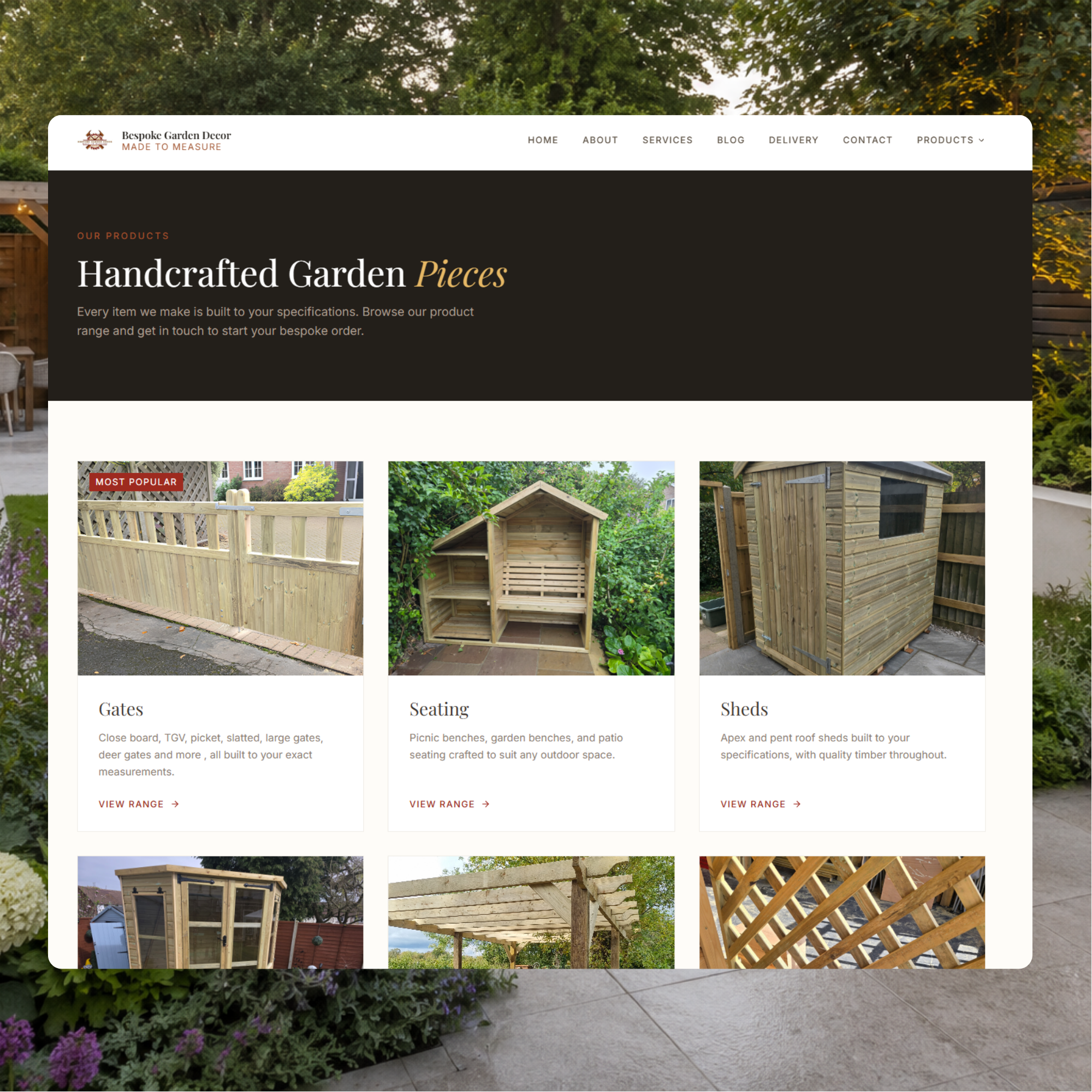
Type, hierarchy and spacing are decided as a system rather than page by page. That is what keeps page forty looking like page one, and it is the difference between a design and a set of screens that happen to share a colour.
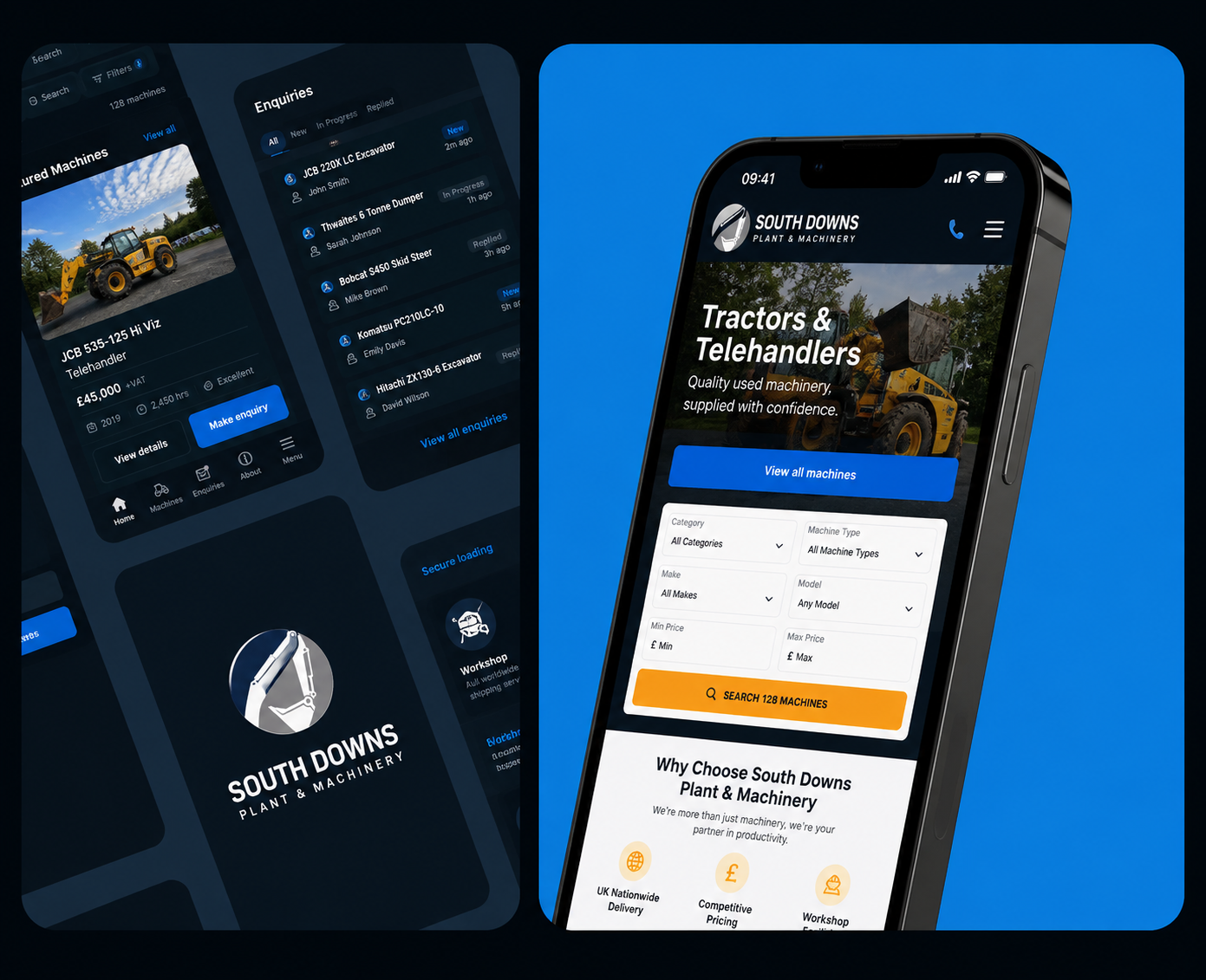
Responsive is not the desktop layout at a smaller size. A narrow screen changes what belongs at the top, what can fold away and what a thumb can reach — so it gets designed, not derived. We draw at three widths and check on real devices, because a browser window dragged narrow is not a phone.
Want to book an intro meeting with us?
Have a website in mind, or just want to talk an idea through? Tell us where you're at and we'll take it from there.
Build
Built by the people who drew it
The build is where design quality is usually lost: spacing rounds off, motion gets approximated, and the state nobody drew is invented on the spot by whoever hit it first. One team designing and building removes the translation step where all of that happens.
Speed is a design decision, not a phase at the end. Image weight, font loading and what runs on the main thread are settled while the pages are still being drawn, then held to a budget in CI — so the site is still quick a year after the launch it was measured at.
Where you need to change things yourself, we build the parts that should change and leave the rest alone. A content model that cannot break the layout is worth considerably more than an editor that lets anyone move anything anywhere.
Motion earns its place by explaining something — where you are, what just happened, what is about to. And nothing ships until the responsive behaviour, the links, the keyboard path and the numbers have been checked on real devices. A site is finished when it has been tested, not when it has been uploaded.
What you get
- Sitemap, content model and structure
- Full design system, drawn at three breakpoints
- Next.js App Router build
- CMS integration and editor training
- Performance budget, enforced in CI
- Deployment, analytics and a runbook
How it runs — 5 weeks
- 01Structure1w
- 02Art direction1w
- 03Page design1w
- 04Build1w
- 05Integration and launch1w
Timelines assume one round of consolidated feedback per phase. If you need this faster, say so early — it usually means changing the scope rather than the schedule.
Build a full scope