Services
Interfaces people don’t have to think about
Our approach
Good interfaces should feel obvious
Obvious is the hardest thing to design. It is what is left once the decisions a person never needed to make have been removed — and every one of those was put there by someone reasonable, for a reason that made sense at the time.
So we start with what someone is trying to get done, not with screens. Where they arrive from, what they are deciding, where they stall, and the point at which they give up and phone you instead. That last one is usually the most useful thing anyone says all week.
Structure is settled before anything is styled: hierarchy, sequence, what belongs on one screen and what does not. Visual design is a great deal easier when it has something correct to be applied to.


Structure and interface
Hierarchy before decoration
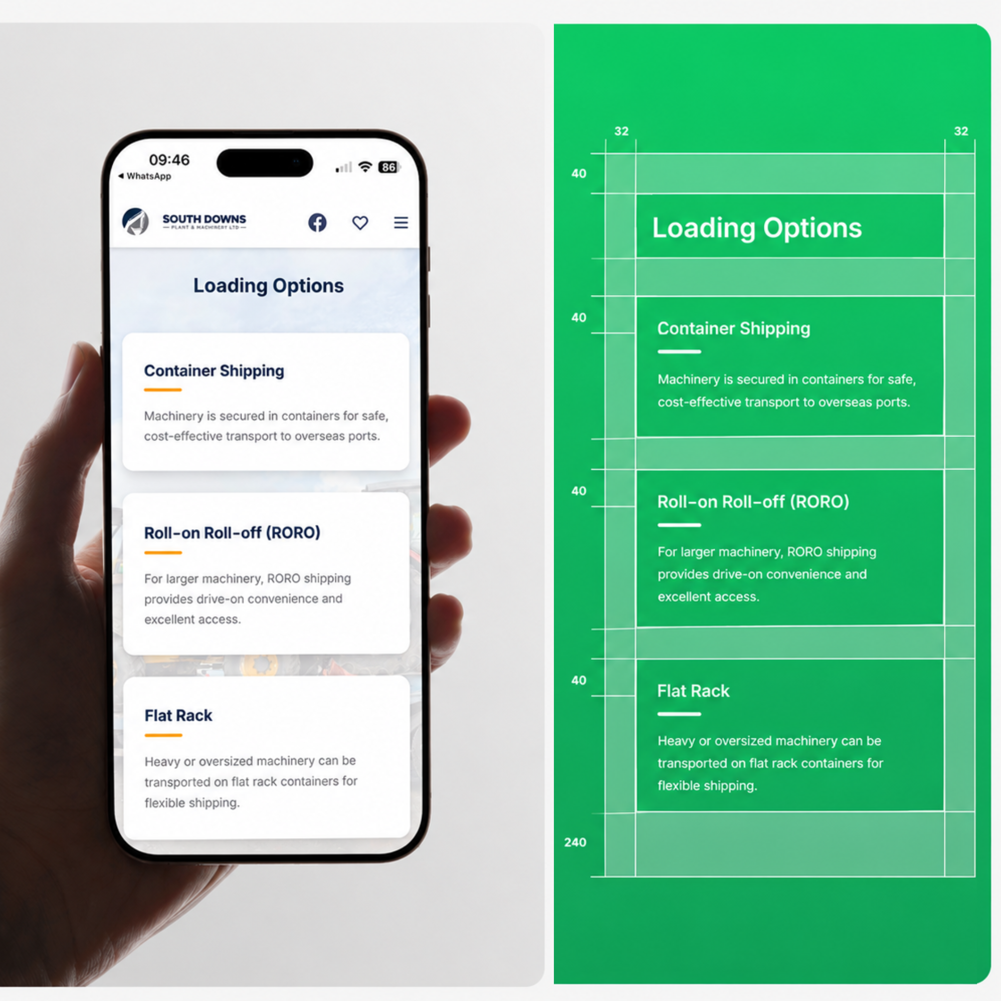
Information architecture is the part nobody asks for and everybody feels. What sits at the top level, what is one tap down, and whether things are named in your customer's words or your org chart's. Get that wrong and no amount of visual polish rescues it.
Wireframes exist to be argued with. They are deliberately unfinished so the conversation stays on sequence, priority and what a screen is actually for — rather than on a shade of blue applied to something that has not been agreed yet.
The interface then goes on top of a structure that already works, and it should look like you rather than like the defaults of whatever it was built in. Distinctive and obvious are not opposites; most templates manage neither.
Behaviour
Important interactions have to be used, not imagined
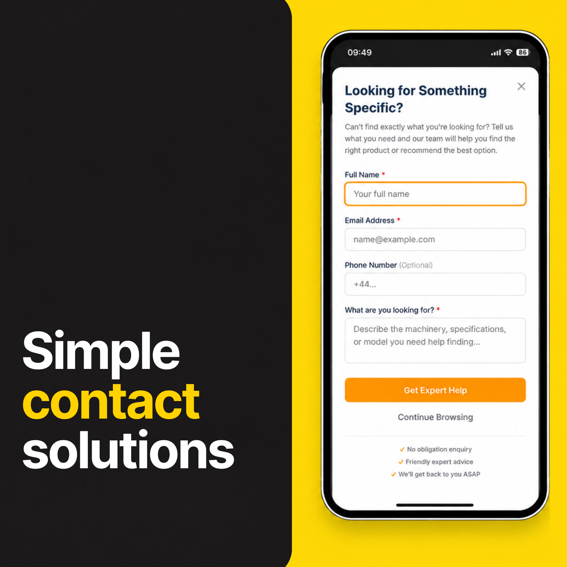
Anything with real behaviour — a multi-step form, a filter, a search that returns nothing — gets prototyped and put in front of someone before it is built. A flow can read perfectly on a wall and fall apart on the second tap.
Mobile is not a smaller desktop. What can be hovered, how much fits before a decision drops below the fold, whether a control belongs at the top of the screen or under a thumb — all of that changes with the screen, so all of it gets designed for the screen.
What survives becomes a system: named components, defined states, and rules for the cases nobody has drawn yet. That is what stops an interface drifting the moment the product grows past the screens we made.
And we show work early, in whatever state it is genuinely in. Feedback on something unfinished is useful. Approval of something finished is a signature.
What you get
- Journey maps, with the decision points marked
- Information architecture and naming
- Wireframes at three breakpoints
- Interactive prototype of the flows that matter
- Interface design and component library
- Design system with every state documented
How it runs — 4 weeks
- 01Journeys and audit1w
- 02Architecture and wireframes1w
- 03Interface design1w
- 04Prototype and iterate1w
Timelines assume one round of consolidated feedback per phase. If you need this faster, say so early — it usually means changing the scope rather than the schedule.
Build a full scope